Project Deep Dive

Building a Meetings & Callings Hub for Prosumer users 

Building a Meetings & Callings Hub for Prosumer users 

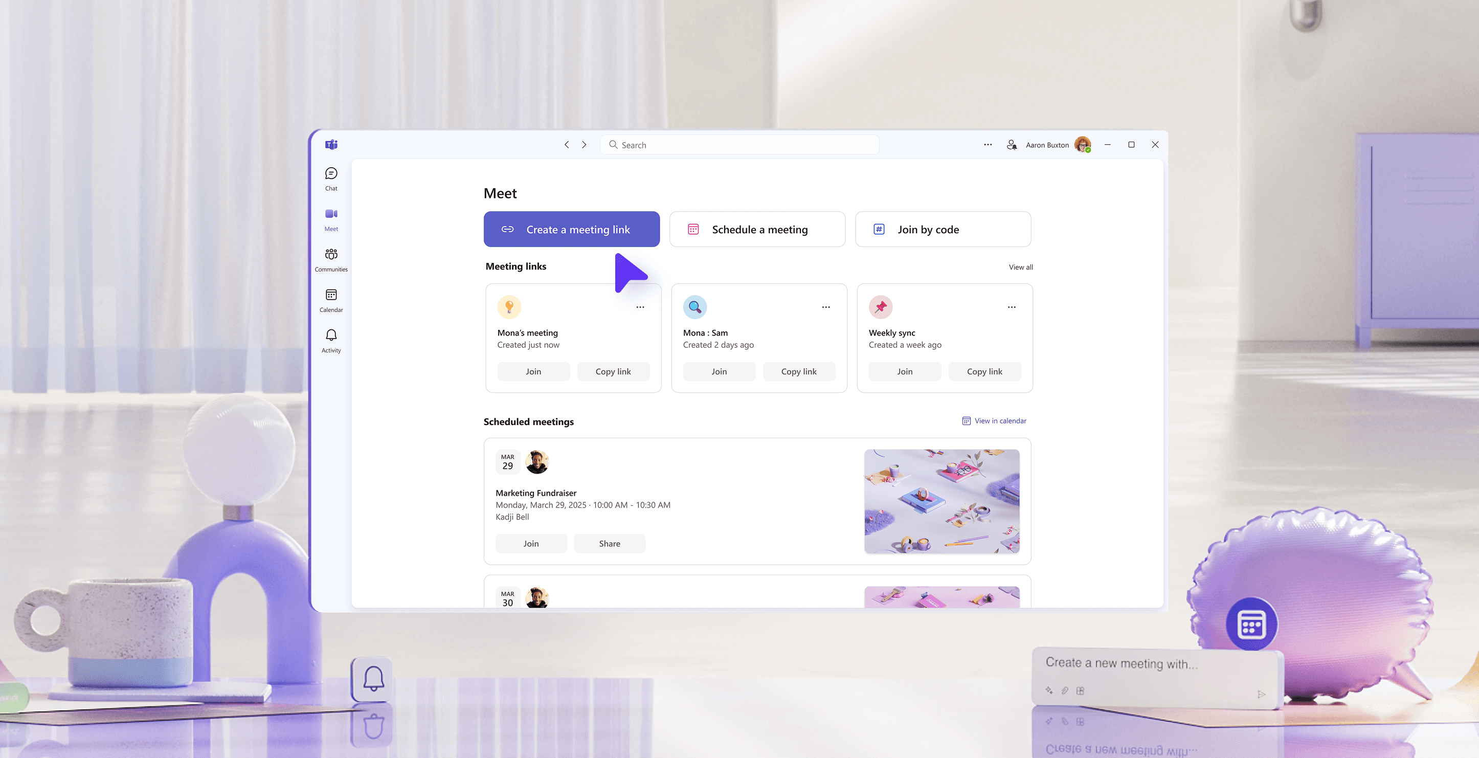
I collaborated with another designer to ideate and ship the "Meet app", a one stop shop within Teams Free for users to start, join, schedule and share meetings effortlessly. It addressed the two ways to meet in Teams: ad hoc and scheduled and combines them in an accessible app.

This targets the pain point of the "free" prosumer user who unlike our enterprise customers are operating primarily outside the Microsoft ecosystem. Meet app gives them a clear glance of their meetings capabilities on Teams and offers them a flexible way to invite and connect with others.

Challenge

Challenge

The Ad Hoc and Scheduled meetings experience was being looked at by two separate product teams each defining and working on area specific features. One was focused on building in chat and the other in calendar. I was the owner of the scheduled area and was focused on simplifying the calendar view to address the lower volume of events. Since we were working in silos, neither of the two experiences were fully capturing the core use cases.

The challenge came in three folds. First being brainstorming and validating early ideations, second being convincing stake holders, third being executing with polish.

Kicking Off With a Design Sprint

Between the two product teams, we had one shared researcher who helped us to realize that the two experiences share similar functionality and terminologies. With that insight, I coordinated a design sprint that brought together both teams—designers, researchers, PMs, and engineers—for a collaborative brainstorm to align on a unified vision. From the sprint we were able to establish baseline goals and must haves as a successful meeting provider

Goals
Identify areas of inconsistency in product, cross-platform experience, terminology, and framework.
Define the shared direction for scheduled and ad hoc meetings.

Must haves
Link management - Give users an easy to manage ad hoc meeting links
Aggregation - See all upcoming time based meetings
Liveness - Show what users need to be aware of at the moment

Early iterations

We defined simplicity as our core principle. Instead of overcrowding with functionality and building for non-existing users, we began with a list of things that we are not trying to be. This is done in collaboration with user research and existing customer feedback.

We are not
a calendar app (low usage, work focused, 3P options)
a calls app (chat already does that with context)
eventbrite (heavy-duty event planning, discovery)

Our goal is to be a place where users can easily create and see their ad-hoc and scheduled meetings aggregated in one place. With that in mind, we wanted clear CTAs on the left rail and a distinct 1:1 connection with the artifacts on the right.

Early brainstorming & ideation

Between the two product teams, we had one shared researcher who helped us to realize that the two experiences share similar functionality and terminologies. With that insight, I coordinated a design sprint that brought together both teams—designers, researchers, PMs, and engineers—for a collaborative brainstorm to align on a unified vision. From the sprint we were able to establish baseline goals and must haves as a successful meeting provider

Goals
Identify areas of inconsistency in product, cross-platform experience, terminology, and framework.
Define the shared direction for scheduled and ad hoc meetings.

Must haves
Link management - Give users an easy to manage ad hoc meeting links
Aggregation - See all upcoming time based meetings
Liveness - Show what users need to be aware of at the moment

We defined simplicity as our core principle. Instead of overcrowding with functionality and building for non-existing users, we wanted the app to adhere to the clear goals that were decided during the sprint. With that in mind, we began designing an action oriented left rail that has a distinct 1:1 connection with the artifacts on the right.

After collaboratively working on the IA, I dove into the details of the schedule flow while the other designer focused on the meeting links.

Next steps

With the initial designs mocked up, we worked closely with our user researcher to test the early mocks. The feedback was positive and many mentioned how it felt more lightweight and streamlined in comparison to the existing calendar app.

"[I’m] used to seeing a calendar and it's something I expected. But, I went through this demo without it, and I didn't need it. I would have wanted [calendar], but then I saw the visuals, I do not want [calendar]. Now the calendar just feels like work."

With


Let's create impactful designs together!

Let's create impactful designs together!

If you're on the lookout for a dedicated and impassioned digital designer to breathe life into your vision, your search ends here. Let's unite to craft unforgettable experiences that resonate deeply, leaving an enduring mark.

Copyright © 2024

Copyright © 2024

Copyright © 2024